Lifestyle Magazines
In this magazine the model is placed there to show that she is slim, and that you can be like her if you are slim. "Never Look Old!" meaning that once the target audience reads this part of the text stands out and makes them want to be slim. There is not much text as the designer wants the reader to look at the model, so that they can see what they can become. The language used is very persuasive and is making the audience believe they can be slim and healthy. The colour of the text relates to her dress, because it is a colour of passion and love. This dress then makes her look slim this then relates to the title and makes women feel like they should wear red
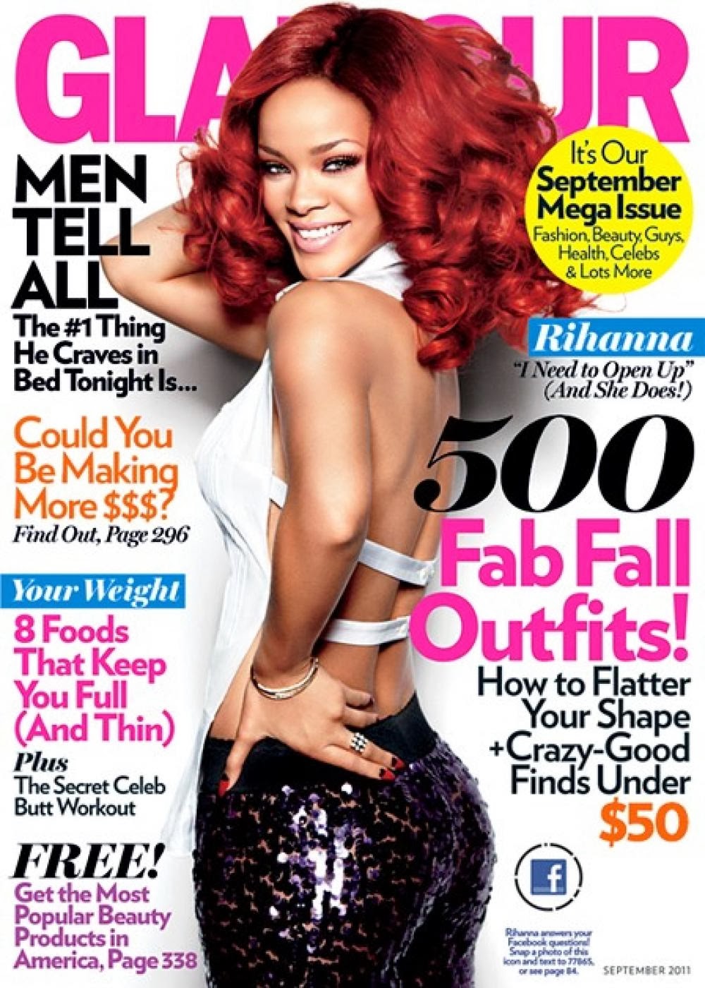
The magazine stands out because of the bright colours this then attracts the audience to read, the font is very big so it is easy to read. Rhianna slim so they put "8 Foods That Keep You Full (And Thin)" so that the target audience have someone to look up to, and that "Men Tell All The 1 thing he craves in bed tonight is.." so the audience will want to be thin and get "500 Fab Fall Outfits"."Could you be making more $$$" this then makes the audience want to know the secrets of making money and the colour catches there eye so they can read on.
The magazine is aimed at women because of the background and what to wear next season, with baby pink colours and a celebrity with all the new looks. The magazine is saying Kim Kardashian is all loved up and this is because of her beauty and she is with the style. The language is telling the audience what to wear and the advertising makes the audience seem like Kim uses these brands. Kim stands out more then the text because of the layout it makes the audience think that she is wearing the brands and this makes people think that they will look good. Pink is the colour beauty and the audience will feel that Kim is pretty and will get new brands and her pink lip stick shows she has beauty

The mens health magazine has chosen David Beckham because of his muscles and he is not fat he is a perfect shape for a mens magazine. Young kids look up to him and the bright text really catches the eye of young ambitious football players. Older men will want to get muscles and they will easly be attracted by mens health magazine because they emphasize "ABS" and David Beckham shows that he is in shape this then leads the audience to read on.
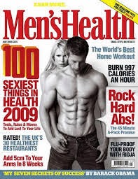
This magazine is directed at men and the model with muscles is there to inspire young men to get muscles. The model behind him is telling the audience that you can get a girl with "Rock Hard Abs!" this catches the eye of most readers, because of the font and the bright colours. The language is telling you what you can do but it isn't saying you can do it. The text is surrounding the model because it all relates to him and the designers needs the audience to know that it is possible. All of the models on the mens health magazine are different, and the layout is different to reassure to the audience that its believable and then they would buy the magazine. Red can resemble toughness and men will want to read this because they think there tough and then want to know "100 SEXIEST THINGS IN HEALTH 2009".
GREEN
Really good piece of work with the right amount of detail and analysis. Well Done.


 Asymmetrical balance by shape
 Asymmetrical by position
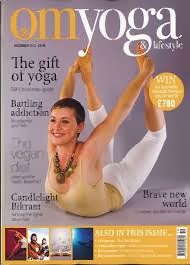
 Asymmetrical by eye direction
